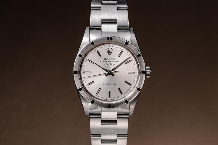
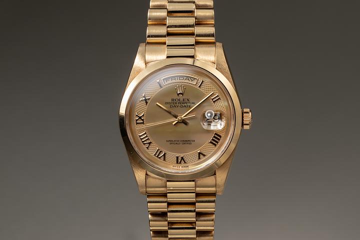
Rolex Watch Face Design and Heritage Through the Decades

The Art of the Dial: Understanding Rolex Watch Face Design Through History
There is something quietly remarkable about a Rolex dial. You may not be able to explain immediately why it holds your attention, but it does. The proportions feel deliberate. The indices sit exactly where they should. The color does not compete with anything else — it simply exists with purpose. That is not an accident. Rolex has spent over a century refining what a watch face should be, and the result is a design language so consistent and so thoughtful that it has become one of the most recognized visual identities in the world. If you have ever wondered what actually goes into a Rolex dial and why collectors treat certain versions with such reverence, this is the place to start.
Where It All Began: Early Rolex Dial Philosophy in the 1920s and 1930s
Rolex was founded in 1905, but the dial designs that truly began shaping its legacy emerged through the 1920s and into the 1930s. Early Rolex dials leaned toward simplicity, reflecting the prevailing watchmaking conventions of the era. Arabic numerals, railroad minute tracks, and clean sector-style layouts were common. What made Rolex distinct even then was the emphasis on legibility. Hans Wilsdorf, the founder, understood that a watch needed to be read quickly and accurately — that function could not be separated from form. The dials from this period were modest but already showed a kind of purposeful restraint that would become a Rolex signature.
The 1950s: When Iconic Rolex Dial Features First Took Shape
The 1950s were arguably the most important decade for Rolex dial development. This was the era that produced the original Submariner, the GMT-Master, and the Day-Date, each of which introduced face elements that remain in production today. Applied hour markers replaced printed ones on many references, giving dials a three-dimensional quality and a sense of depth. The Mercedes hands — named informally for their resemblance to the automotive logo — appeared on the Submariner and became one of the most recognizable hand shapes in horology. Two-tone dials, including the iconic black and gilt combination found on early Submariners, reflected the printing and lacquer techniques of the period. These dials are now among the most sought-after in vintage watch collecting.
Tropical Dials: The Accidental Icons of Rolex Heritage
No conversation about Rolex dial history is complete without addressing tropical dials. These are not dials that were designed to look the way they do. They are dials that changed over time — typically from black or brown original lacquer — due to chemical reactions triggered by UV light, humidity, and heat exposure. The result is a warm, faded tone that ranges from chocolate brown to a deep caramel, sometimes with uneven gradients that give each dial a completely unique appearance. The watch collecting community did not always see this as desirable. But over time, the rarity and organic individuality of tropical dials transformed them into some of the most valuable Rolex faces ever documented. A 1960s Submariner or Paul Newman Daytona with a confirmed tropical dial can command prices that vastly exceed examples with original undisturbed dials.
The 1960s and 1970s: Experimentation, Color, and the Birth of the Exotic Dial
By the 1960s, Rolex was producing dials in a broader range of materials and finishes. The Datejust began appearing with dials crafted from onyx, meteorite, and eventually lacquered enamel in colors that feel almost unexpected from such a conservative house. The 1970s brought a surge in experimentation — wood dials, stone dials, and highly decorative iterations were produced in limited quantities. These are sometimes referred to as exotic dials, and they represent a fascinating and often overlooked chapter in Rolex design history. The Rolex Day-Date from this era was particularly adventurous, pairing unusual dial materials with the prestige of the President bracelet. These decades proved that Rolex could balance heritage with genuine creativity.
Key Rolex Dial Elements That Define the Brand's Visual Identity
Understanding what makes a Rolex dial recognizable comes down to a handful of consistently applied design principles. Each element plays a specific role in the overall visual hierarchy of the watch face.
Applied hour markers in precious metal or luminous material Coronet logo printed or applied at the twelve o'clock position Model name and reference details printed cleanly in the lower dial register Cyclops lens magnification positioned over the date window on most references Superluminova or earlier Tritium lume on hands and indices for low-light readability Sunburst and guilloche finishing techniques on metal dials to create depth and visual interestThese details vary across references and decades, but together they create a design system that is immediately identifiable. Even someone unfamiliar with horology can often recognize a Rolex at a glance, which speaks to the strength and consistency of the visual language Rolex has maintained.
Modern Rolex Dials: Refinement Over Revolution
Contemporary Rolex dials continue the philosophy established decades ago — improve quietly, never compromise the foundation. The current generation of dials benefits from advances in lacquering, luminescent material, and dial printing precision that would have been technically impossible in earlier eras. References like the modern Submariner date feature dials with a depth and finish quality that are genuinely impressive under magnification. Rolex has also introduced new color references in recent years, including the popular Olive and Slate dials on the Explorer and GMT-Master lines, responding to collector and market demand while keeping the core design vocabulary intact. What Rolex does not do — and this is important — is redesign for the sake of novelty.
Why Dial Condition Matters So Much in Vintage Rolex Collecting
If you are researching vintage Rolex watches, dial condition is not a secondary concern — it is often the primary factor in determining value. An original, unpolished dial in honest condition will almost always be preferred by serious collectors over a dial that has been refinished or restored, even if the refinish looks cosmetically superior. The reason is authenticity. A dial that has aged naturally tells the true story of the watch. Fading lume plots, original gloss or matte finish, intact printing, and correct aging patina are all details that collectors and auction specialists examine closely. Replacement dials, even correct-era replacements, reduce value significantly on most reference points. This is why proper documentation and provenance matter so deeply in the vintage Rolex market.
Find Your Next Vintage Rolex Dial at Tropical Watch
For collectors and enthusiasts who understand that the dial is the heart of any Rolex, finding a trusted source for vintage pieces is everything. Tropical Watch specializes in exactly this kind of careful, knowledgeable curation — offering authenticated vintage Rolex watches with transparent documentation and genuine expertise in dial condition assessment. Whether you are pursuing a tropical Submariner, an exotic Day-Date, or a pristine early Datejust, exploring the vintage Rolex watch collection at Tropical Watch connects you with pieces that represent the full depth of Rolex dial heritage. The team at Tropical Watch approaches every acquisition with the same standard serious collectors apply — originality, honesty, and a thorough understanding of what makes these dials genuinely rare.
Frequently Asked Questions About Rolex Watch Face Design
What is a tropical dial on a Rolex watch?
A tropical dial is a Rolex dial that has chemically changed color over time due to exposure to UV light, humidity, and heat. Originally black or dark brown, these dials develop warm, faded tones ranging from chocolate to caramel. They are highly sought after by collectors for their rarity and organic uniqueness.
Why do Rolex dials use applied hour markers instead of printed ones?
Applied hour markers are three-dimensional metal pieces affixed to the dial surface, creating depth and a sense of quality that printed markers cannot replicate. Rolex began transitioning to applied markers in the 1950s as part of a broader commitment to dial refinement and legibility.
How does dial condition affect the value of a vintage Rolex?
Dial condition is one of the most significant factors in vintage Rolex valuation. An original, unrestored dial with natural aging will consistently command higher prices than a refinished example. Collectors prioritize authenticity, and any alteration to the dial — even skilled restoration — typically reduces market value.
What are exotic dials in the context of Rolex watches?
Exotic dials refer to Rolex dials crafted from unusual materials such as meteorite, onyx, wood, or natural stone. These were produced primarily in limited quantities during the 1960s and 1970s, most commonly on the Day-Date reference. They represent a distinct and often underappreciated chapter in Rolex design history.
What does the Coronet logo on a Rolex dial signify?
The five-pointed crown, or Coronet, printed at the twelve o'clock position on every Rolex dial is the brand's official logo and trademark. It serves as a symbol of quality assurance and brand identity, appearing consistently across all references since it was formally adopted in the mid-twentieth century.
What is the difference between lume on vintage and modern Rolex dials?
Vintage Rolex dials used Radium and later Tritium-based luminescent material, which ages to a cream or warm ivory color over time. Modern dials use Superluminova, a non-radioactive compound that maintains consistent brightness and color. The aged lume plots on vintage dials are considered a desirable patina indicator and help authenticate a watch's originality.


