Rolex Logo Meaning and Design: Symbolism of the Iconic Crown
The Rolex Crown Logo: A Symbol That Speaks Before the Watch Ever Does
There are logos, and then there are icons. The Rolex crown sits firmly in the second category. Before you read a single word on the dial, before you feel the weight of the case on your wrist, that five-pointed crown has already told you everything you need to know. It signals precision. It signals prestige. It signals that whoever is wearing this watch made a deliberate choice. Understanding what that logo actually means, where it came from, and why it continues to define an entire category of luxury is worthwhile for any serious watch enthusiast or prospective buyer.
A Brief History of the Rolex Logo
Rolex was founded in 1905 by Hans Wilsdorf and Alfred Davis in London, though the brand would later move its operations to Geneva, Switzerland. From the beginning, Wilsdorf had a vision that extended well beyond simply making watches. He wanted to create a name and a mark that people could trust with precision timekeeping. The crown logo as it is recognized today was formally introduced in 1925, though Rolex had been building its reputation for accuracy and quality for two decades prior. The choice of a crown was not accidental or arbitrary. It was a calculated decision rooted in aspiration and identity, one that has remained virtually unchanged for a century. That kind of visual consistency across a hundred years is genuinely rare in any industry, and it says something significant about the clarity of the brand's original intent.
What the Crown Actually Represents
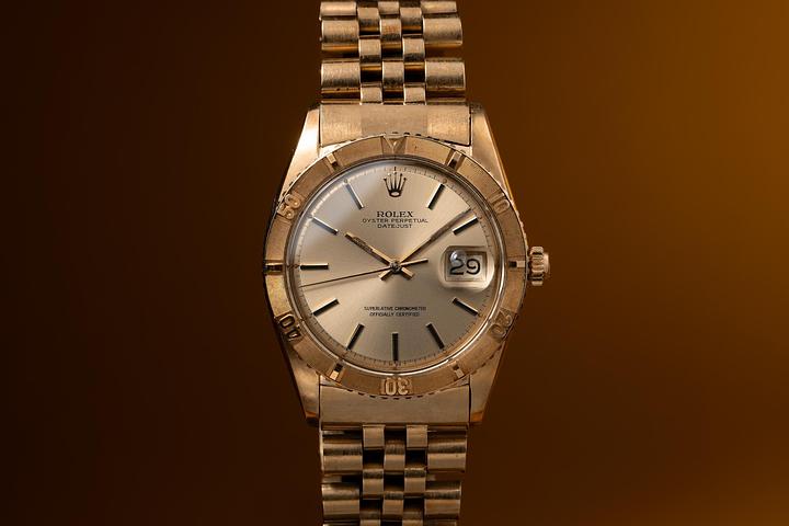
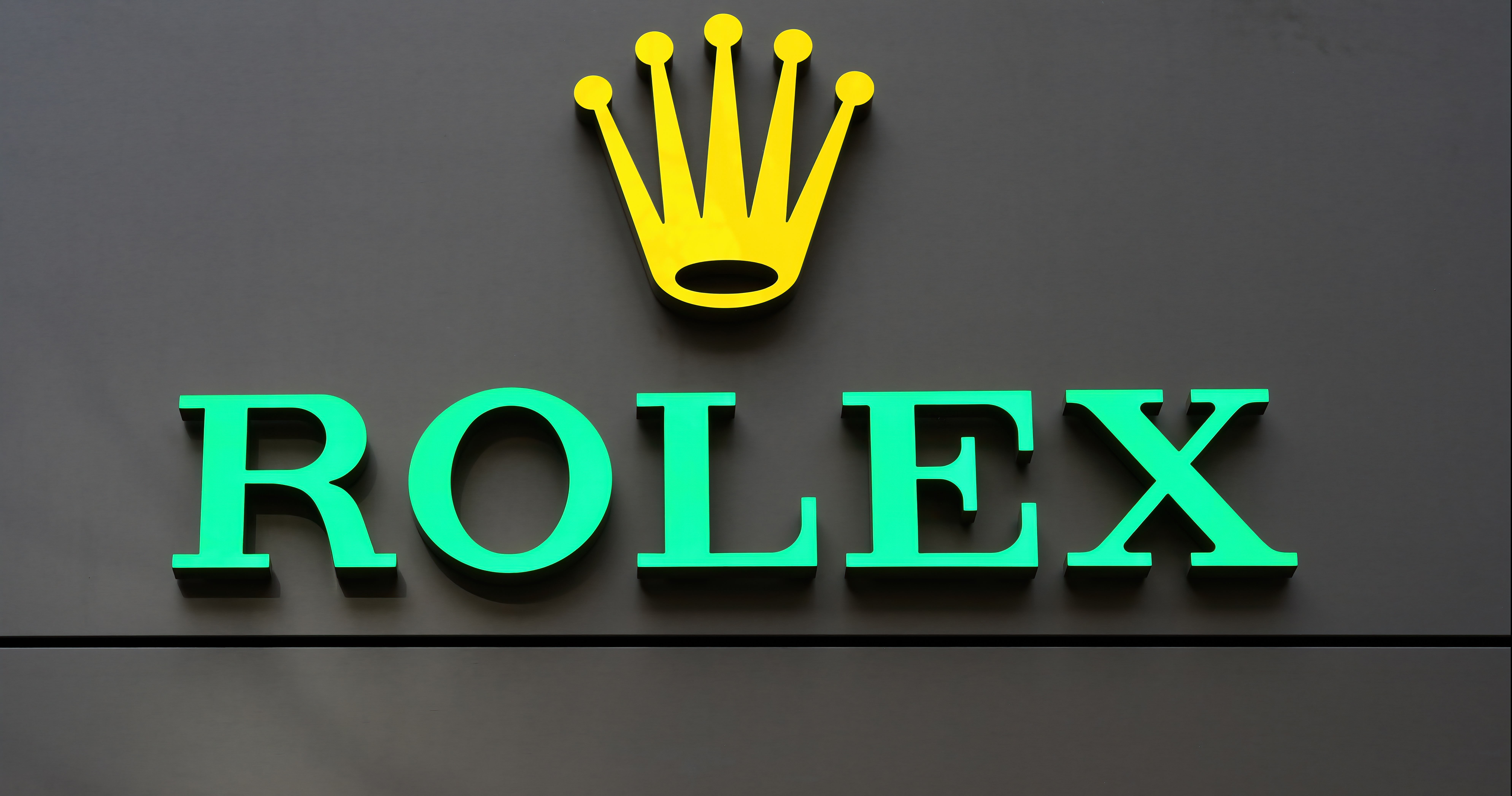
The Rolex crown logo is a five-pointed coronet, rendered in a clean, golden yellow that has become one of the most recognizable color applications in luxury goods. Each of the five points on the crown is interpreted to represent one of the five fingers of the human hand, which in turn references the craftsmanship and precision of the watchmakers behind every timepiece. That connection to the human element of watchmaking is deliberate. Rolex has always positioned itself at the intersection of mechanical engineering and artisanal skill, and the crown reinforces that positioning with every single appearance. Beyond the fingers metaphor, the crown symbol has universal associations with royalty, authority, achievement, and excellence. When Wilsdorf selected this imagery, he was aligning his brand with the very top of whatever hierarchy existed, not just in watchmaking, but in any field of human endeavor.
Design Details That Make the Logo Work
The Rolex logo is deceptively simple. At a glance, it reads as a clean, symmetrical crown sitting above the brand name in a bold serif typeface. But the proportions are carefully calibrated. The crown is neither too ornate nor too minimal. It carries enough visual weight to command attention without becoming cluttered or decorative in a way that would date it. The golden color choice has a practical dimension as well. On a watch dial, against virtually any background, gold reads clearly and communicates value instantly. The typeface paired with the crown, a strong, upright serif, reinforces a sense of tradition and authority without appearing old-fashioned. Together, the crown and the wordmark create a logo system that feels equally at home on a billboard, a watch box, a retail storefront, and the dial of a timepiece no larger than a few centimeters across. That scalability and adaptability are signs of genuinely sophisticated design.
The Logo as a Quality Assurance Mark
Over the decades, the Rolex crown has evolved into something that functions almost like a certification seal. Collectors and buyers around the world have come to understand that the presence of this logo on a dial represents a specific set of manufacturing standards. Rolex produces its own alloys, develops its own movements, and maintains stringent quality controls at every stage of production. The COSC chronometer certification that many Rolex movements carry is just one measurable component of a broader commitment to excellence that the crown symbolizes. For buyers in the pre-owned and vintage market especially, the logo serves as an immediate reference point for value. When that crown appears correctly applied, in the right position, with the right color and proportion on a dial, it is one of the first indicators of authenticity that experienced collectors look for.
Royal Warrants and the Crown Connection
The connection between Rolex and actual royalty is more than symbolic. In 1945, Rolex was granted the Royal Warrant by King George VI of the United Kingdom, which authorized the brand to display the Royal Arms. This was a meaningful institutional recognition of the brand's quality. The crown imagery in the logo takes on additional resonance when you consider this history. Rolex was not simply borrowing royal symbolism for marketing purposes. It was building a track record of excellence that would eventually earn legitimate royal recognition. That heritage matters in the luxury watch world, where provenance and history carry real commercial weight. When you understand this context, the crown logo shifts from a branding element to a historical document of sorts, one that captures the arc of a company that genuinely earned its place at the top of the industry.
How the Logo Influences Perception and Value
Brand psychology research consistently shows that logos with strong symbolic associations command premium pricing and greater consumer loyalty. The Rolex crown operates exactly this way. Studies of luxury consumer behavior indicate that buyers of high-end watches often cite brand recognition and heritage as primary purchasing drivers, sometimes ranking above technical specifications. The crown logo is a direct contributor to that recognition effect. On the secondary and vintage market, watches with clear, well-preserved logo application on the dial command meaningfully higher prices than those with faded or damaged markings, all other factors being equal. This is not superficial. The logo is part of the watch's integrity and its story. For collectors, that matters enormously.
Spotting Authenticity Through the Logo
For anyone navigating the pre-owned or vintage Rolex market, understanding the logo in detail is a practical skill. Several key indicators are worth knowing:
The crown should be proportionally centered above the Rolex name on the dial The gold coloring should be consistent and clean, without bleeding or fading at the edges On modern references, the crown is laser-etched at the 6 o'clock position on the crystal The serif typeface of the brand name should be sharp and evenly spaced On vintage dials, the aging of the logo should be consistent with the overall patina of the dial Counterfeit watches frequently get the proportions of the crown subtly wrong, making it appear too large, too small, or slightly asymmetrical
These details are the difference between a confident purchase and a costly mistake, especially in a market where prices for desirable references can reach six figures or more.
Why Tropical Watch Is the Right Place for Your Rolex Journey
If the history and meaning behind the Rolex crown has deepened your appreciation for these timepieces, and you are now considering adding one to your collection, where you buy matters as much as what you buy. Tropical Watch is a trusted destination for collectors and first-time buyers alike, offering a curated selection of authenticated luxury timepieces with a focus on vintage Rolex references that carry real history. When you explore iconic vintage Rolex watches with authenticated crown dial markings, you are working with specialists who understand the nuances of dial condition, logo integrity, and provenance documentation that serious collectors demand. The expertise behind Tropical Watch means that every watch in the collection has been evaluated with the same attention to detail that Rolex itself brings to its craft. That alignment of values is not incidental. It is exactly the kind of purchasing environment that a timepiece bearing that iconic crown deserves.
Frequently Asked Questions About the Rolex Logo
What does the Rolex crown logo symbolize?
The Rolex crown logo represents excellence, authority, and precision craftsmanship. The five points of the crown are widely interpreted as representing the five fingers of the human hand, connecting the symbol to the skilled artisanship behind every Rolex timepiece.
When was the Rolex crown logo first introduced?
The Rolex crown logo was formally introduced in 1925, roughly two decades after the brand was founded in 1905. It has remained largely unchanged since, making it one of the most consistent logos in the history of luxury goods.
Why is the Rolex logo gold?
The gold coloring of the Rolex crown is a deliberate design choice that communicates value, prestige, and excellence. It also has a practical function, reading clearly against virtually any dial background and maintaining strong visual contrast at small sizes.
How can the Rolex logo help identify a fake watch?
Counterfeit Rolex watches frequently have subtle flaws in the crown logo, including incorrect proportions, uneven coloring, or asymmetrical points. On modern Rolex watches, a laser-etched crown also appears at the 6 o'clock position on the crystal, which is difficult to replicate accurately on fakes.
Does the Rolex logo affect the value of a watch?
Yes, significantly. On pre-owned and vintage models, the condition and integrity of the logo on the dial directly affects the watch's market value. A well-preserved crown marking is considered a key indicator of dial originality and overall authenticity.
Has the Rolex crown logo ever changed?
The Rolex crown has undergone only minor refinements since its introduction in 1925. The fundamental shape, symbolism, and color have remained consistent across a century of production, which is a significant achievement in brand identity and reflects the company's deep commitment to its heritage.